When the lights rose on Alvin Ailey's Cry in 1971, Judith Jamison's white leotard didn't just clothe her—it transformed her into every woman, every struggle, every triumph. In lyrical dance, color isn't decoration; it's narrative. Yet too often, costume selection becomes an afterthought, with companies defaulting to matching sets without considering how hue, saturation, and fabric interaction can amplify—or undermine—choreographic intention.
This oversight costs performances their full emotional potential. Strategic color coordination directs audience attention, unifies ensemble movement, and translates abstract emotion into visible experience. Here's how to harness color as a choreographic tool rather than a logistical checkbox.
Why Color Fails: Common Mistakes in Lyrical Costuming
Most color errors in lyrical dance stem from three misconceptions: that coordination means uniformity, that studio appearance equals stage appearance, and that emotional themes automatically translate to obvious color choices.
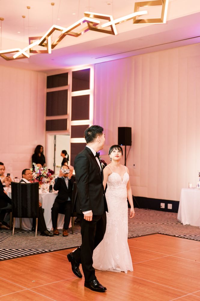
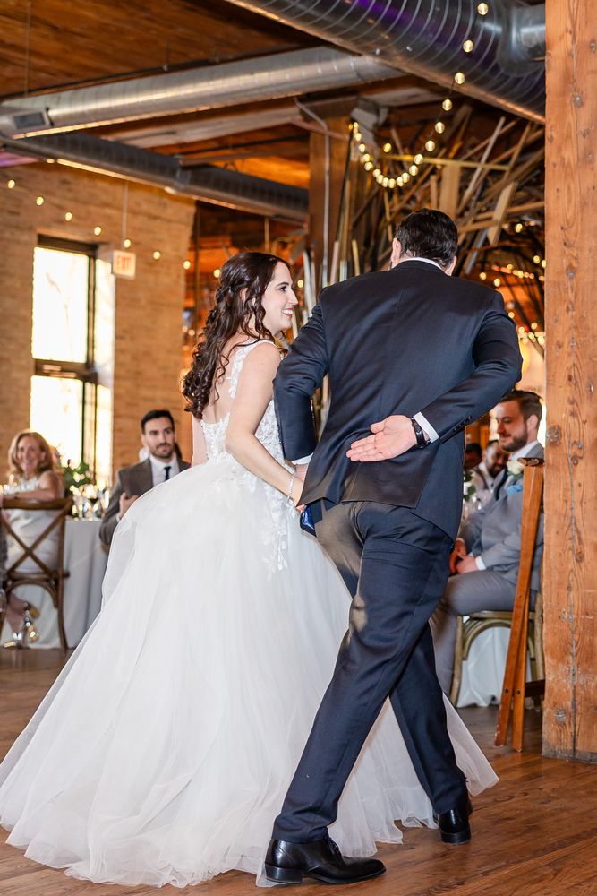
A studio mirror lies. That dusty rose leotard reading as romantic under fluorescent rehearsal lights may flatline under amber gels, while what appeared subtle becomes invisible against a cyclorama. Similarly, dressing twelve dancers in identical scarlet creates visual monotony rather than passion—no focal point, no dynamic tension, no breathing room for the eye.
The most damaging assumption? That "love" means pink, "sadness" means blue, "anger" means red. This literalism flattens lyrical dance's nuanced storytelling into greeting-card symbolism.
The Three Principles of Performance Color
1. Psychological Precision
Color operates below conscious perception. Research in performance psychology demonstrates that saturated warm tones (crimson, coral, burnt orange) advance visually and elevate perceived energy, while cool desaturated tones (slate, sage, dusty lavender) recede and lower physiological arousal. Lyrical dance's emotional arc demands strategic deployment of both.
Intensity hierarchy provides the framework: deploy saturated colors for climactic sections or featured soloists; employ desaturated tones for ensemble work or transitional passages where movement itself commands attention. A dancer in amber emerging from a slate-gray ensemble doesn't merely appear—she arrives.
2. The Lighting Variable
Modern stage lighting has complicated color selection. LED fixtures render colors differently than conventional tungsten sources, often intensifying blues and muting reds. Color temperature matters: warm lighting (3200K) enriches earth tones but can yellow pure whites; cool lighting (5600K) sharpens blues and greens while draining warmth from skin tones.
The washout effect—where intense stage lighting bleaches costume color—demands compensation. Fabrics should appear approximately 20% more saturated in studio than desired onstage. Always test under actual performance lighting, with full movement, before finalizing selections.
3. Fabric-Color Collaboration
Chiffon in sage green reads as ethereal; the same hue in velvet becomes somber. Lyrical dance's flowing movements demand fabrics where color and drape collaborate:
| Fabric | Light Interaction | Best Applications |
|---|---|---|
| Matte jersey | Absorbs light, mutes color | Intimate, grounded pieces |
| Iridescent mesh | Catches and releases light | Extensions, aerial work |
| Silk charmeuse | Reflects with liquid movement | Romantic, fluid sequences |
| Power mesh | Maintains color saturation through stretch | Dynamic, athletic choreography |
Texture modifies color perception. Shiny surfaces reflect surrounding hues, creating chromatic complexity that static swatches cannot predict.
Inclusive Color Strategy
Color coordination must serve every dancer in the ensemble. Pastels—long favored for lyrical dance's "soft" aesthetic—can wash out melanin-rich complexions under stage lighting, creating unintended visual hierarchy.
Jewel tones (emerald, sapphire, amethyst, garnet) flatter diverse skin tones while maintaining the emotional register typically sought in lyrical performance. Costume designer Patricia Fielding, whose work spans regional ballet and commercial contemporary, recommends testing fabric swatches against the full company under performance lighting before final selection.
For mixed ensembles, consider ombré or gradient approaches that place saturated tones on deeper complexions and lighter values on fairer skin, creating visual equilibrium rather than forced uniformity.
Application Scenarios
Solo Performance
The soloist enjoys chromatic freedom but bears full responsibility for visual interest. Monochromatic costuming—varying value and texture within a single hue—creates sophistication without distraction. Consider the negative space: what color is the floor? The backdrop? The soloist exists in relationship to these elements.
Ensemble Work
Group costuming requires hierarchical thinking. Identify architectural moments in the choreography—unison phrases, canon sequences, featured trios—and assign color values accordingly. A common effective strategy: desaturated base with three dancers in accent color for structural emphasis, rotating accent placement throughout the piece.
Competition vs. Concert
Competition environments demand