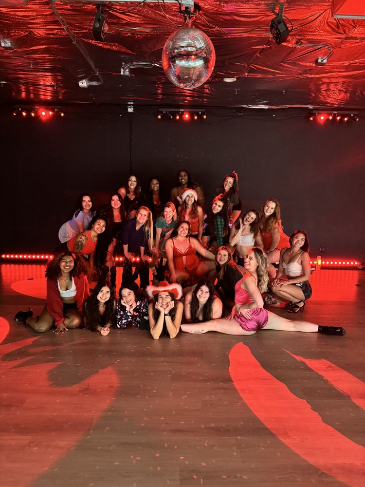
The lights drop. The bass hits. And suddenly you're not in a gym—you're in a Miami nightclub, a Rio street festival, a Bogotá salsa club. Your Zumba instructor materializes in electric cobalt and laser-cut neon, and you realize: this workout doesn't just allow color. It demands it.
Zumba's explosive energy isn't accidental. Born in Colombia during the 1990s, this dance-fitness hybrid carries the DNA of carnival culture, street celebration, and unapologetic self-expression. Your outfit isn't merely functional—it's a communication device, broadcasting your energy to the room and amplifying your own psychological readiness to move.
The Cultural Color Code
Before Zumba became a global phenomenon, founder Beto Pérez taught aerobics classes in Cali where participants wore whatever made them feel alive. That spirit persists in every official Zumba Wear collection, which draws directly from Latin dance traditions:
- Salsa reds and passionate purples mirror the intensity of Cuban and Puerto Rican social dancing
- Tropical yellows and oranges channel cumbia's coastal Colombian roots
- Urban neons and electric blues reflect reggaeton's underground-to-mainstream evolution
- Carnival greens and magentas honor the street festivals where many rhythms originated
Understanding this lineage transforms your color choices from arbitrary to intentional. You're not just picking a cute top—you're participating in a visual tradition of celebration.
Color Psychology in Motion
Research on exercise psychology confirms what Zumba veterans know instinctively: color affects performance. A 2020 study in Frontiers in Psychology found that warm colors (red, orange, yellow) increased perceived energy and exercise intensity, while cool colors (blue, green) promoted endurance and recovery mindset.
Strategic color selection can shape your workout experience:
| Color | Psychological Effect | Best For |
|---|---|---|
| Red | Increased heart rate, intensity | High-cardio peaks, competitive moments |
| Yellow | Optimism, sustained energy | Long aerobic sequences |
| Blue | Calm focus, perceived coolness | Recovery tracks, mind-body connection |
| Green | Balance, reduced exertion perception | Sustained moderate intensity |
| Neon/fluorescent | Alertness, social visibility | Dim studios, building community recognition |
Smart Zumba practitioners rotate their palette based on class format. Zumba Toning demands colors that coordinate with resistance band aesthetics—often bold primaries that photograph well for social sharing. Aqua Zumba calls for metallics and iridescents that shimmer underwater. Zumba Gold, designed for active older adults, often features sophisticated saturation rather than jarring brightness.
The Practical Palette: What Actually Works
Beyond psychology, physics matters. Studio lighting dramatically alters how colors perform:
Dim, nightclub-style studios: Neon and fluorescent fabrics absorb invisible ultraviolet light and re-emit it as visible glow. This isn't just dramatic—it helps instructors track your movement patterns and provide corrections.
Bright, mirror-lined rooms: Saturated jewel tones (emerald, sapphire, amethyst) maintain their richness under harsh lighting where pastels wash out.
Outdoor Zumba: UV-protective dyes in darker bases prevent sun damage while strategic bright panels maintain visibility for safety.
Sweat management introduces another variable. Dark navy and black hide moisture but can feel psychologically heavy during intense summer sessions. Strategic placement—dark base with bright mesh panels—solves both problems. Patterned fabrics, particularly those with Zumba's signature abstract designs, disguise wear from floor work and frequent washing better than solids.
Making Your Statement: Advanced Color Strategy
Generic fashion advice fails in Zumba's specific context. These approaches leverage color for maximum impact:
The Monochrome Moment
Head-to-toe single-color dressing creates visual elongation and serious presence. A crimson jumpsuit or cobalt matching set signals confidence and simplifies morning decisions. The key: varying texture (matte leggings with shimmer top) to prevent flatness.
Strategic Contrast
Color-blocking highlights movement mechanics. Bright tops with dark bottoms draw attention to arm styling and torso isolation—crucial for salsa and merengue tracks. Reversing this (dark top, bright bottom) emphasizes footwork and hip action during cumbia and reggaeton.
Building Your Signature
Regular attendees often develop recognizable color signatures. "The woman in coral" or "neon-green guy" becomes shorthand for community identity. This recognition builds instructor relationships and class accountability—people notice when your signature color is absent.
Seasonal Intelligence
Zumba Wear releases limited-edition color palettes tied to global fashion cycles and cultural moments. Early access to these drops signals insider status. Meanwhile, post-season sales offer opportunity to experiment with colors outside your comfort zone at reduced risk.
The Fabric-Color Connection
Not all bright colors perform equally. Technical considerations separate professional-grade Zumba attire from